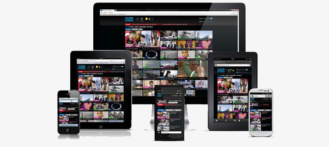
The new year is upon us, and like the start of every year, we return from our holidays refreshed and ready to excel! In true Web Ignite fashion, what better way to prepare for 2014 than look at getting more out of your website?
Statistics show that as of the end of 2013, 63% of phone owners now go online using their phone. If that didn’t seem like a lot, people use tablets even more than phones to surf the web, with tablets and smartphones fast growing as people’s main computing machines; laptops are being replaced with iPads, and this trend is only going to continue as the processing power of portable devices continues to grow.
All of this means that it’s more important than ever to have your website look and feel great on more than just the desktop PC.
This is where responsive websites come in.
Responsive websites are easier to manage and will maintain readable content no matter how large the monitor or small the phone. The methodology of building websites as static, set-in-stone layouts is now a dated thought and a great way to fall behind on your competition.
With devices now coming in all manner of sizes and resolutions, to reach and capture a wider audience, businesses need to consider how their content is going to look on every device, and responsive websites are a highly cost-effective and powerful option.
Web Ignite develops premium mobile-responsive websites at affordable prices. Contact our friendly team at info@webignite.com.au for more information.


